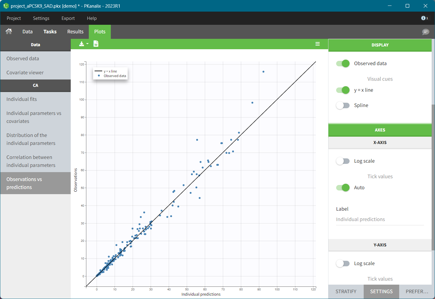
The observations vs predictions plot displays observations (\(y_{ij}\)) versus the corresponding predictions (\(\hat{y}_{ij}\)) estimated by the CA task. It is a useful tool to detect misspecifications in the structural model. The points shall scatter as close as possible along the y = x line (black solid line). If a large amount of points are not scattered close to the identity line, then this might be due to the chosen structural model not capturing certain kinetics. Moreover, the distribution of the dots should be symmetrical around the y=x line, meaning that the model prediction is sometimes abve and sometimes below the observed data.
This plot is generated automatically when you run the compartmental analysis task. You can access it from the CA section in the plots list.
Visual Guides
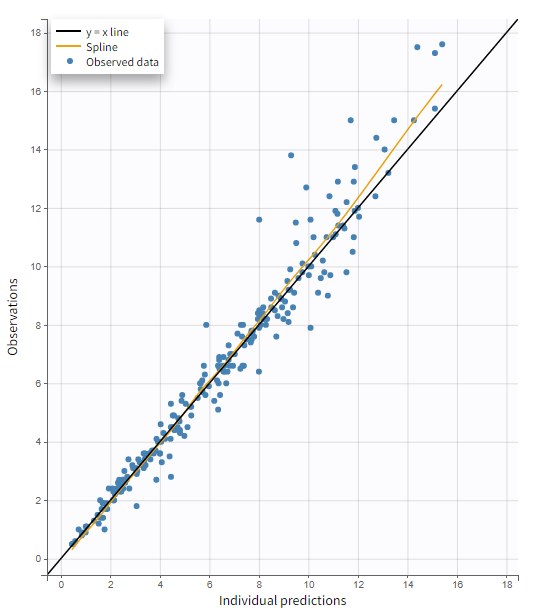
In addition to the observed data, in the DISPLAY settings panel you can add: the identity line y = x and spline interpolation.
Highlight
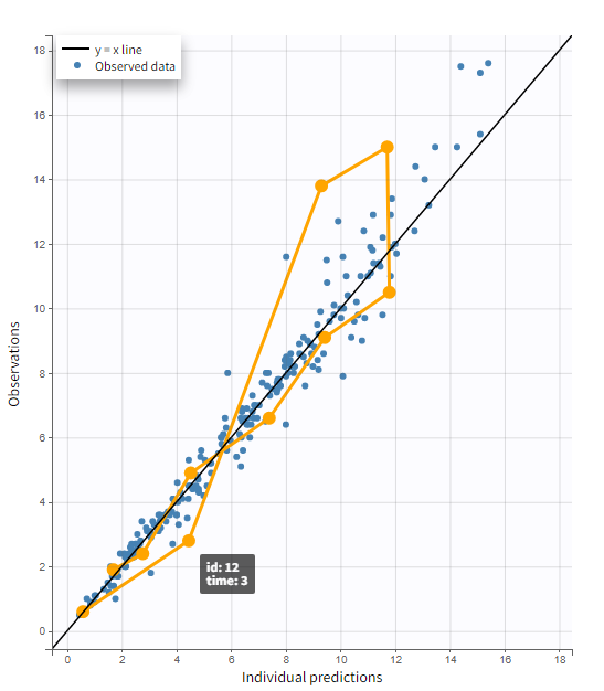
Hovering on any point of observed data shows:
- the subject id and time corresponding to this point
- highlights all the points corresponding to this subject
- segments linking all points corresponding to the same individual to visualize the time chronology.
Highlighting works across plots. An individual data highlighted in this plot, will be highlighted in every other plot to help you in the model diagnosis.
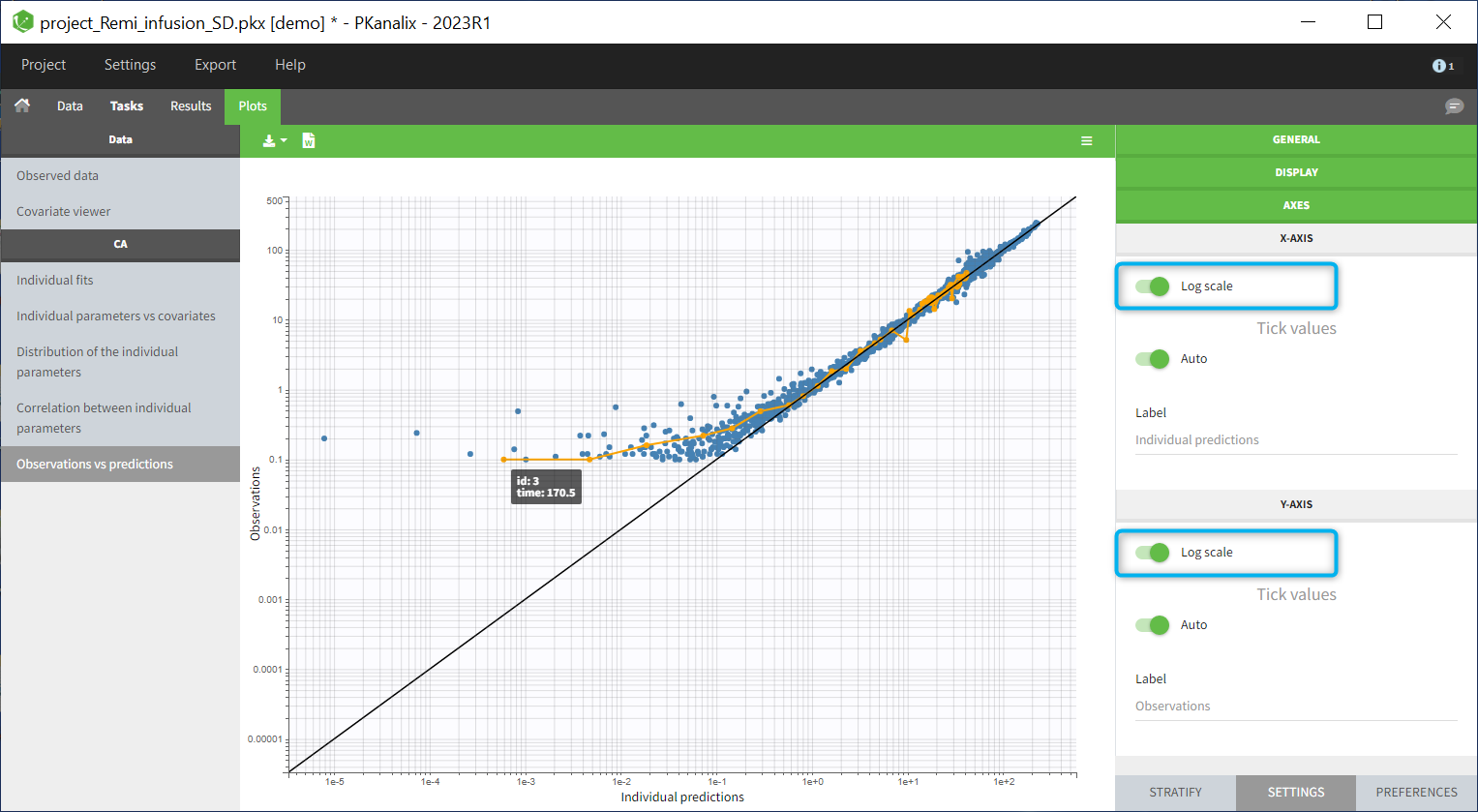
Log scale
A log scale allows to focus on low observation values. You can set it in the AXIS section of the settings panel for each axis separately or for both together.
The example below displays the predicted concentrations of remifentanil, modeled via a two-compartments model with a linear elimination. In this case, the log-log scale reveals a misspecification of the model: the small observations are under-predicted. These observations correspond to late time points, meaning that the last phase of elimination is not properly captured by the two-compartment model. A three-compartment model might give better results.
Settings
- General
- Legend and grid : add/remove the legend or the grid.
- Display
- BLQ data : show and put in a different color the data that are BLQ (Below the Limit of Quantification)
- Visual cues: add/remove visual guidelines such as the line y = x or a spline interpolation.
- Axis
- Use log scale
- Set automatic or manual (user – defined step) tick values
- Edit axis labels
Stratification
You can split, color or filter the plot as described for the observed data.