Purpose
The sequence-by-period plot allows to visualize, for each parameter, the mean and standard deviation for each period, sequence and formulation.
Description
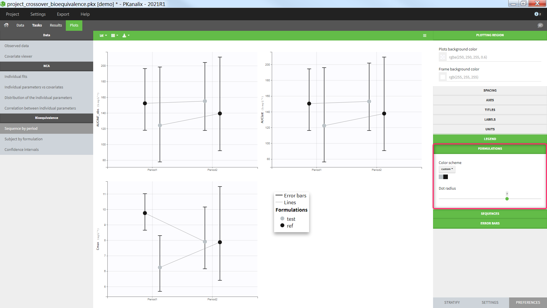
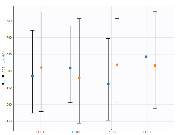
For each formulation, period and sequence (as defined in the Bioequivalence settings), the mean and standard deviation is displayed. The dots are colored according to the formulation, and dots belonging to the same sequence connected by lines. Dots are placed on the x-axis according to the occasion value.
If the parameter has a log-transform (see Bioequivalence settings), the dots represents the geometric mean and the error bars */ the geometric standard deviation. If the parameter is not log-transformed, the dots represent the arithmetic mean and the error bars +/- the standard deviation. NCA parameter values being NaN are excluded and a warning message is displayed.
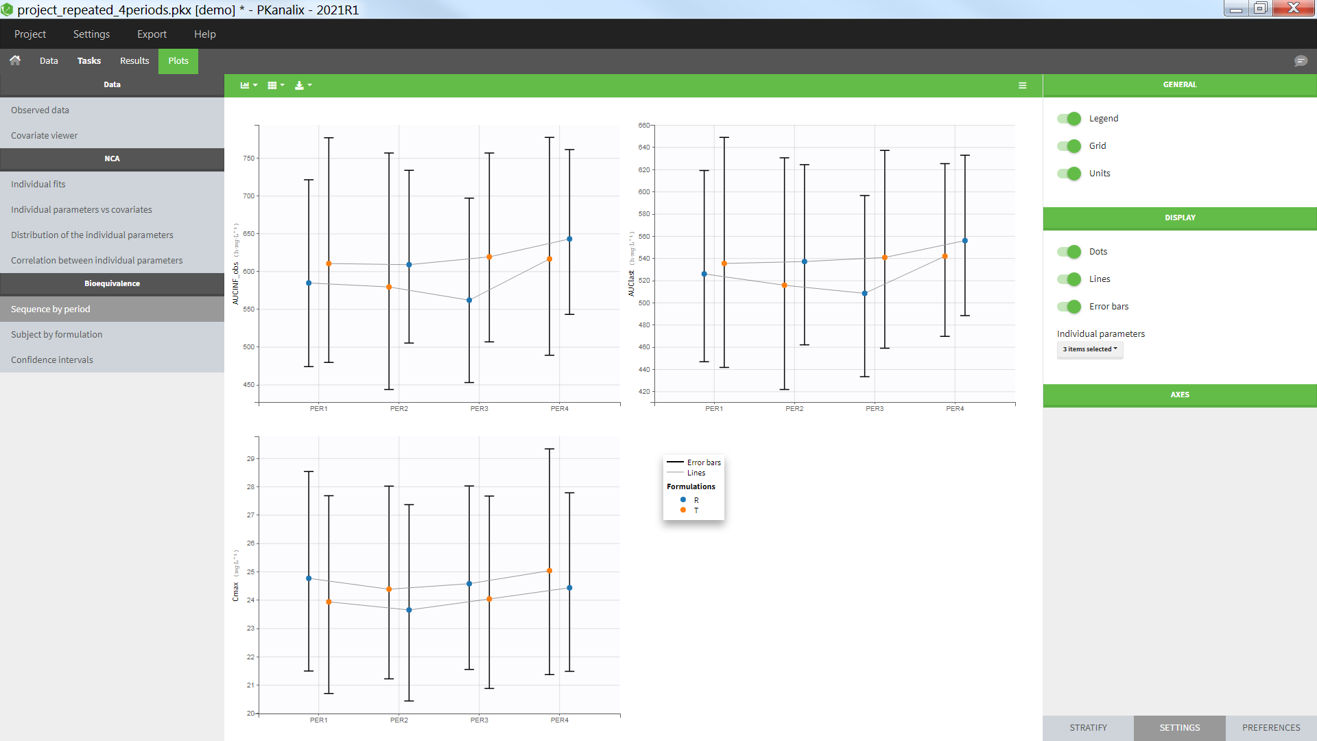
The example below shows a repeated crossover with sequences RTRT and TRTR. Three NCA parameters are displayed.
Troubleshooting
- The connecting lines to do appear:
If the plot setting “Lines” in selected and the connecting lines do not appear, it is because no categorical covariate column as been defined as “Sequence” in the Bioequivalence settings.
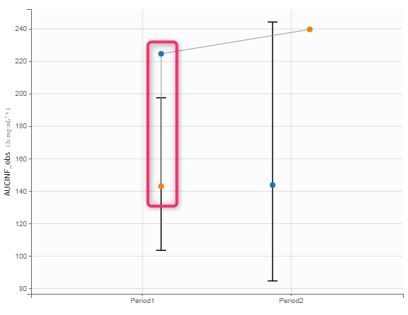
- There are vertical connecting lines:
This means that the column defined as “Sequence” in the Bioequivalence settings is not consistent with the sequence of formulation according to the Occasion column. In the tab “Data”, you can define an “additional covariate” and select the “covariate sequence (XXX)” with XXX being the column representing the formulation. Then use this column as “Sequence” when defining the factors in the model.
- There are several periods on the x-axis although no column was indicated as “period” in the Bioequivalence settings:
When no column is indicated as “period”, we use the column tagged as “occasion” in the data set. If no column has been tagged as “occasion” (parallel design), the occasion is considered to be 1 for all individuals.
Settings
- General
- Legend: hide/show the legend. The legends adapts automatically to the elements displayed on the plot. The same legend box applies to all subplots and it is possible to drag and drop the legend at the desired place.
- Grid : hide/show the grid in the background of the plots.
- Units: hide/show the units of the NCA parameters. Note that the color and surrounding character can be chosen in the plot “Preferences”.
- Display
- Dots: hide/show the dots representing the means
- Lines: hide/show the lines connecting the dots belonging to the same sequence
- Error bars: hide/show the error bars representing the standard deviation
- Individual parameters: select which individual parameters to show on the plot
Stratify
This plot can be split and filtered by the covariates but not colored. The categorical covariate indicated of Formulation in the Bioequivalence settings is automatically used to color the dots. The colors can be changed in the plot “Preferences > Formulations”: