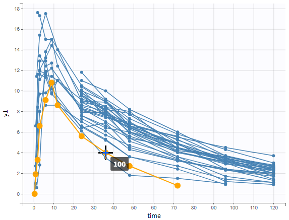
The purpose of this plot, also called a spaghetti plot, is to display the original data w.r.t. time.
In the example below, the concentration of warfarin from the warfarin data set is displayed. A subject is highlighted in yellow by hovering on the line.
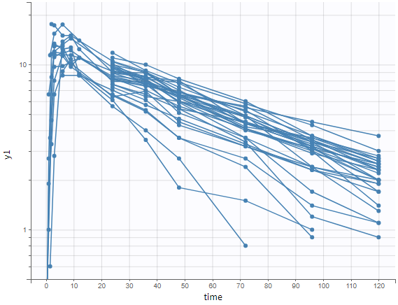
 One can plot the output in a log-scale to have a better evaluation of the elimination part for example as in the figure below.
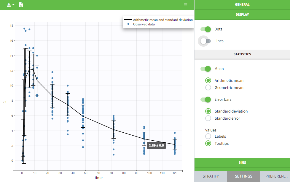
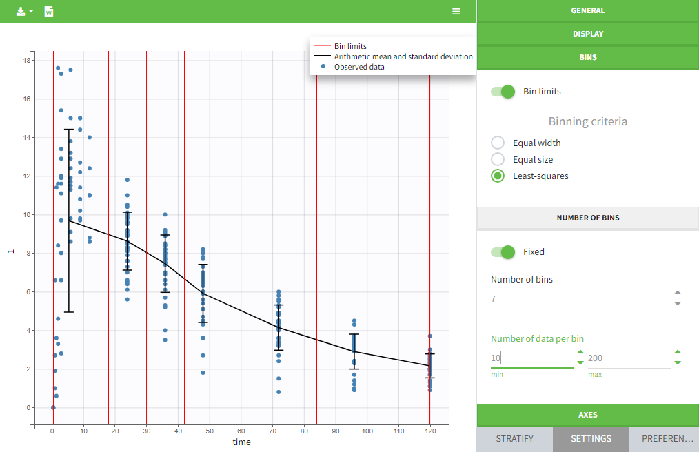
The data can be displayed as dots and lines (by default), or only as dots or only as lines, as in the figure below. In addition, a trend line can be overlaid on the plot, based on mean values of the observed data pooled in bins. The user can choose arithmetic or geometric mean, and can add error bars representing either the standard deviations or standard errors. The mean and error values can be displayed as fixed labels next to the bars, or as tooltips when hovering on a bar.
Bin limits can be displayed as vertical lines, and the user can change the number of bins as well as binning criteria.
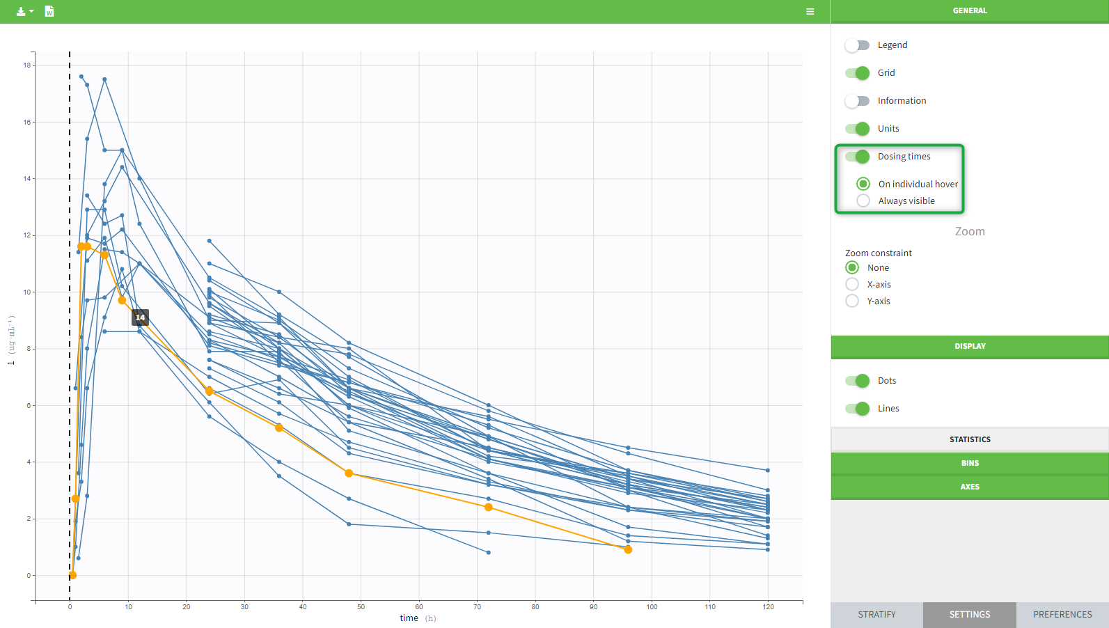
An interesting feature is the possibility to display the dosing time as on the figure below. The individual dosing time of the individual can be displayed when the user hovers an individual or always visible. Starting in version 2021R1 on, dosing times corresponding to doses with null amounts are not displayed.
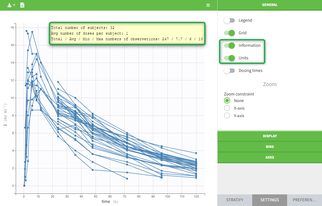
The units as well as additional descriptive statistics of the observations can be displayed. We propose
- The total number of subjects
- The average number of doses per subject
- The total, average, minimum and maximum number of observations per individual.
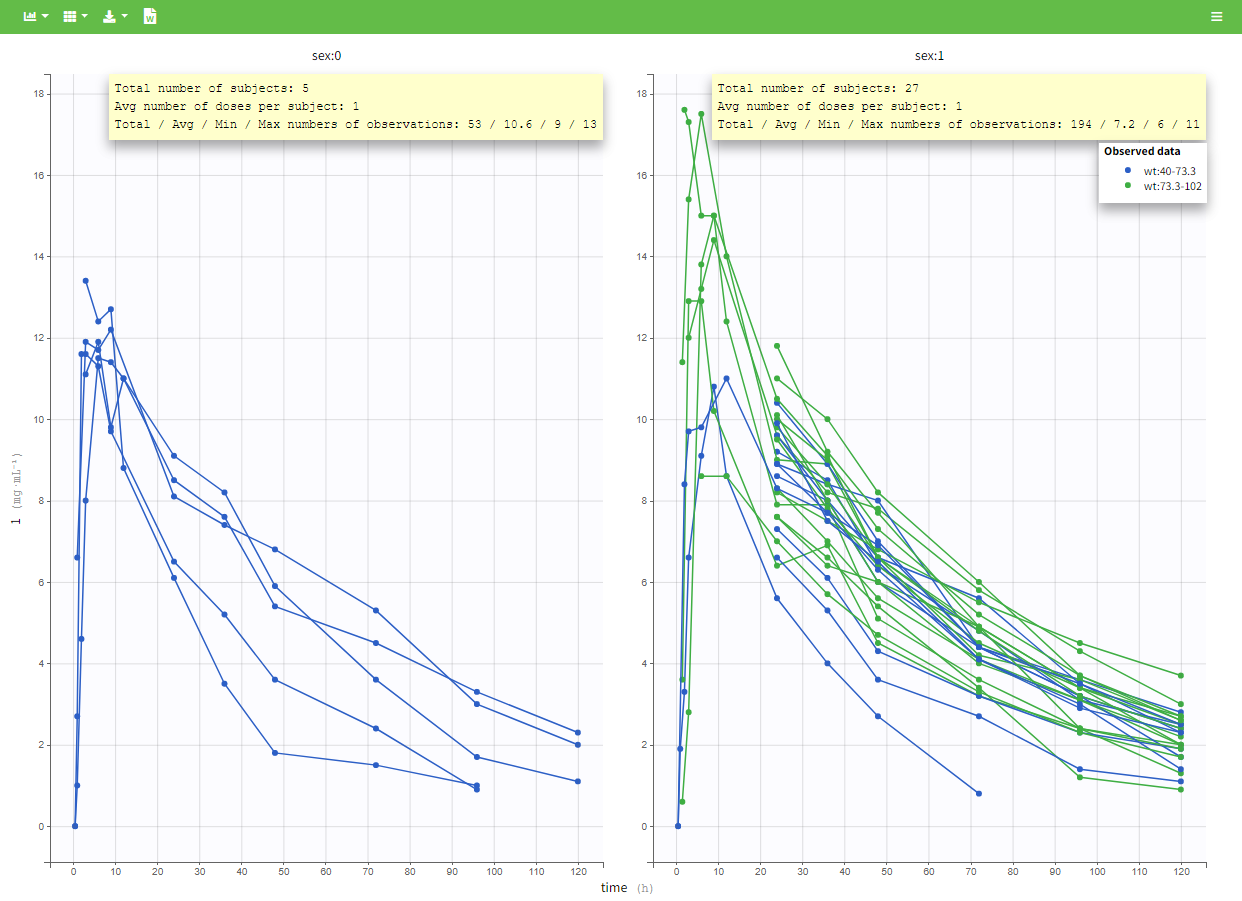
In addition, if we split the graphic with a covariate, these numbers are recomputed to display the information of the group as in the following plot.
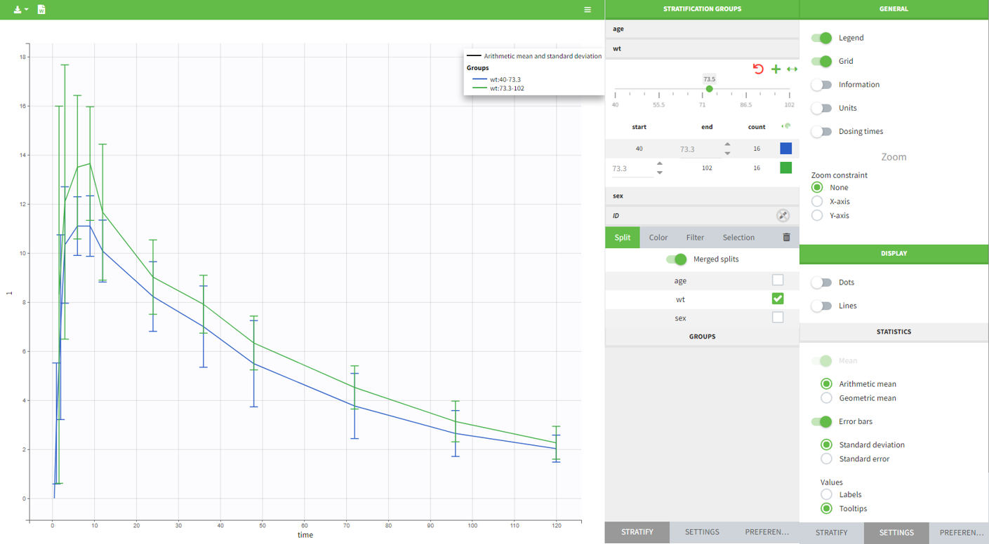
In PKanalix 2023R1 it is now possible to display the mean curves, split by covariate, in a single plot. By switching on the “Merged splits” option, the mean curves of the two wiehgt groups, which appeared in previous versions in separate plots, are merged into a single plot.